R入門3
ggplot2()の基礎
install.packages("tidyverse")
install.packages("dplyr")
Updating HTML index of packages in '.Library'
Making 'packages.html' ... done
Updating HTML index of packages in '.Library'
Making 'packages.html' ... done
ggplot2 is one of the core members of the tidyverse package.
library(tidyverse)── Attaching packages ─────────────────────────────────────── tidyverse 1.2.1 ──
✔ ggplot2 3.0.0 ✔ purrr 0.2.5
✔ tibble 1.4.2 ✔ dplyr 0.7.7
✔ tidyr 0.8.1 ✔ stringr 1.3.1
✔ readr 1.1.1 ✔ forcats 0.3.0
── Conflicts ────────────────────────────────────────── tidyverse_conflicts() ──
✖ dplyr::filter() masks stats::filter()
✖ dplyr::lag() masks stats::lag()
mpgデータセットの説明
hwy : highway miles per gallon
displ : engine displacement, in litres
?mpghead(mpg)| manufacturer | model | displ | year | cyl | trans | drv | cty | hwy | fl | class |
|---|---|---|---|---|---|---|---|---|---|---|
| audi | a4 | 1.8 | 1999 | 4 | auto(l5) | f | 18 | 29 | p | compact |
| audi | a4 | 1.8 | 1999 | 4 | manual(m5) | f | 21 | 29 | p | compact |
| audi | a4 | 2.0 | 2008 | 4 | manual(m6) | f | 20 | 31 | p | compact |
| audi | a4 | 2.0 | 2008 | 4 | auto(av) | f | 21 | 30 | p | compact |
| audi | a4 | 2.8 | 1999 | 6 | auto(l5) | f | 16 | 26 | p | compact |
| audi | a4 | 2.8 | 1999 | 6 | manual(m5) | f | 18 | 26 | p | compact |
print(unique(mpg$class))[1] "compact" "midsize" "suv" "2seater" "minivan"
[6] "pickup" "subcompact"
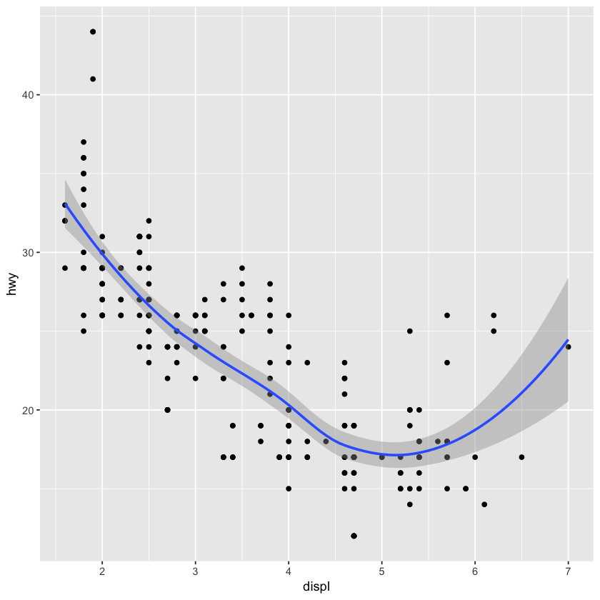
X軸はdisplで、Y軸はhwy, エンジンが大きいければ、燃費が悪いことがわかる。
The function geom_point() adds a layer of points to your plot, which creates a scatterplot.
The mapping argument is always paired with aes(), and the x and y arguments of aes() specify which variables to map to the x- and y-axes.
ggplot2のテンプレートは下のような感じ:
ggplot(data = <DATA>) +
      <GEOM_FUNCTION>(mapping = aes(<MAPPINGS>))
ggplot(data=mpg) +
    geom_point(mapping = aes(x=displ, y=hwy))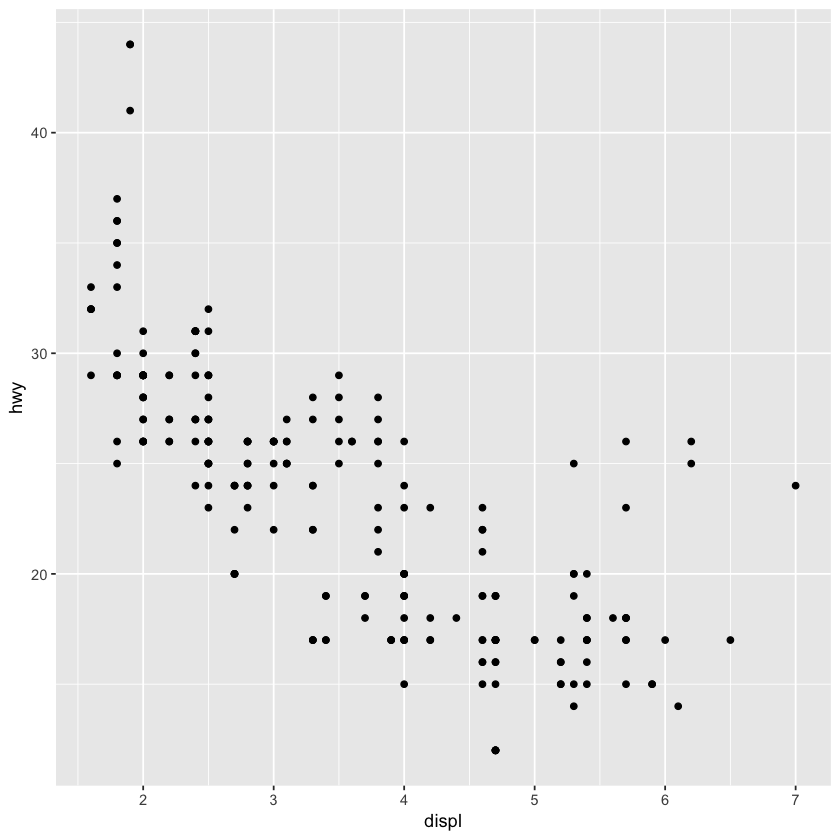
クラスごとに色をつけて、わかりやすくする。 color = classをsize = class、alpha = class、shape = classなどにしてもよい
ggplot(data=mpg) +
    geom_point(mapping = aes(x = displ, y = hwy, color = class))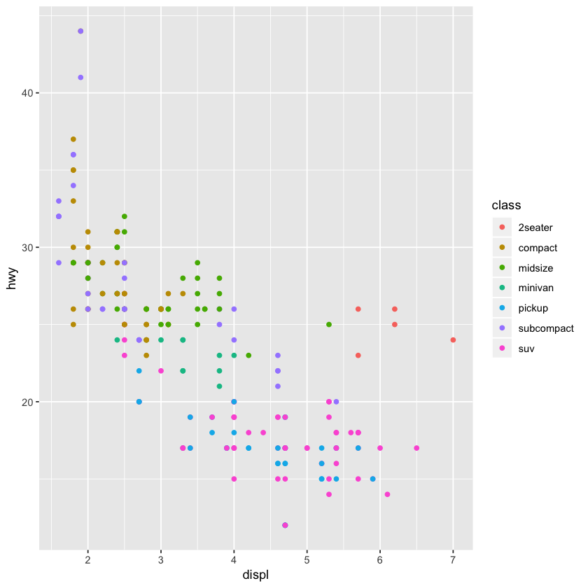
7種類のclassをそれぞれdisplとhwyのscatterplotを描画するため、facet_wrap()を使う
ggplot(data = mpg) +
    geom_point(mapping = aes(x = displ, y = hwy)) +
    facet_wrap(~ class, nrow=2)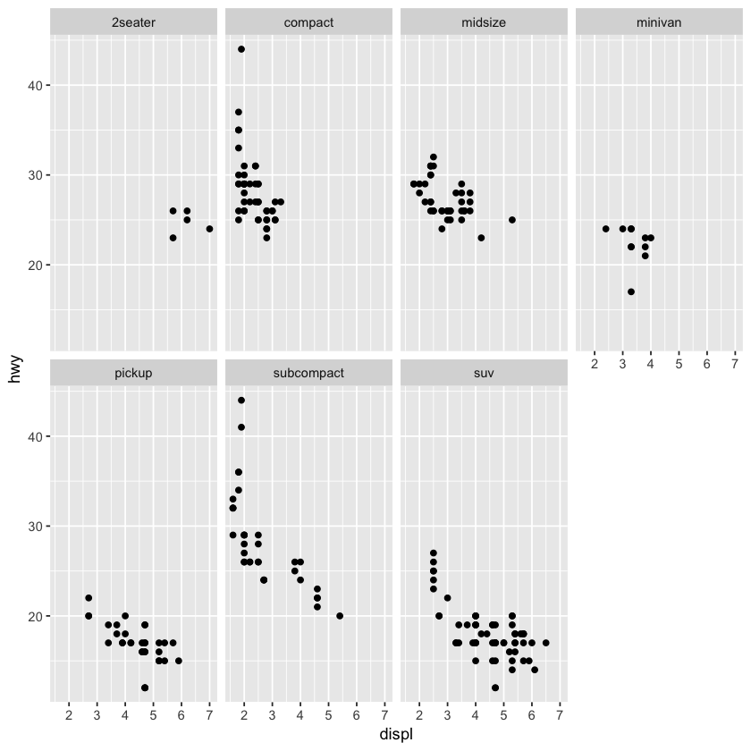
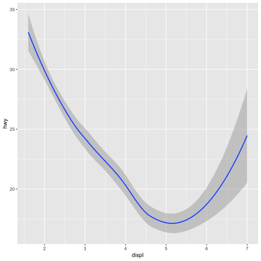
A geom is the geometrical object that a plot uses to represent data. People often describe plots by the type of geom that the plot uses. To change the geom in your plot, change the geom function that you add to ggplot()
ggplot(data=mpg) +
  geom_smooth(mapping = aes(x= displ, y=hwy))
`geom_smooth()` using method = 'loess' and formula 'y ~ x'
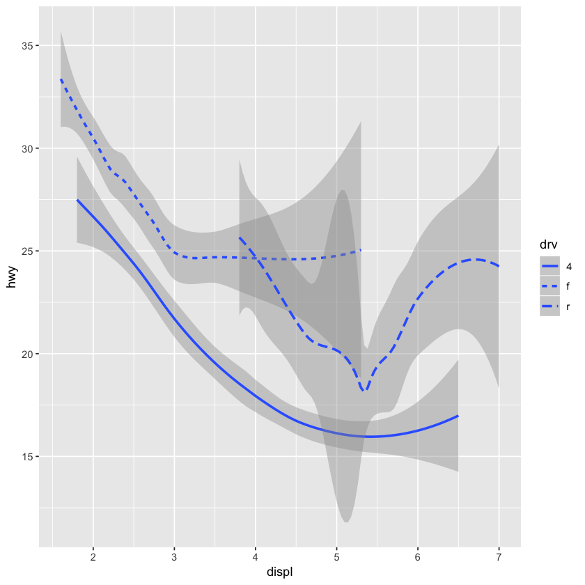
一枚のプロットにdrvごとに描画する。
print(unique(mpg$drv))

ggplot(data = mpg) +
  geom_smooth(mapping = aes(x=displ, y=hwy, linetype=drv))
[1] "f" "4" "r"
`geom_smooth()` using method = 'loess' and formula 'y ~ x'
To display multiple geoms in the same plot, add multiple geom functions to ggplot()
ggplot(data = mpg) +
  geom_point(mapping = aes(x = displ, y = hwy)) +
  geom_smooth(mapping = aes(x = displ, y = hwy))
`geom_smooth()` using method = 'loess' and formula 'y ~ x'
ggplot2 includes eight themes by default. Many more are included in add-on packages like ggthemes, by Jef‐ frey Arnold.
They are theme_bw(), theme_light(), theme_classic(), theme_linedraw(), theme_dark(), theme_minimal(), theme_gray()and theme_void()
library(ggplot2)
ggplot(mpg, aes(displ, hwy)) +
    geom_point(aes(color = class)) +
    geom_smooth(se = FALSE) +
    theme_dark()